Hall Book & Tax
UX DESIGN, WEBSITE DEVELOPMENT - Shipped February 2020
Taxes and bookkeeping can be stressful for any business owner, but Hall Book & Tax wanted to change that. They wanted a website for their fintech company that made taxes and bookkeeping look and feel easy and stress-free.
Project Overview
Approach
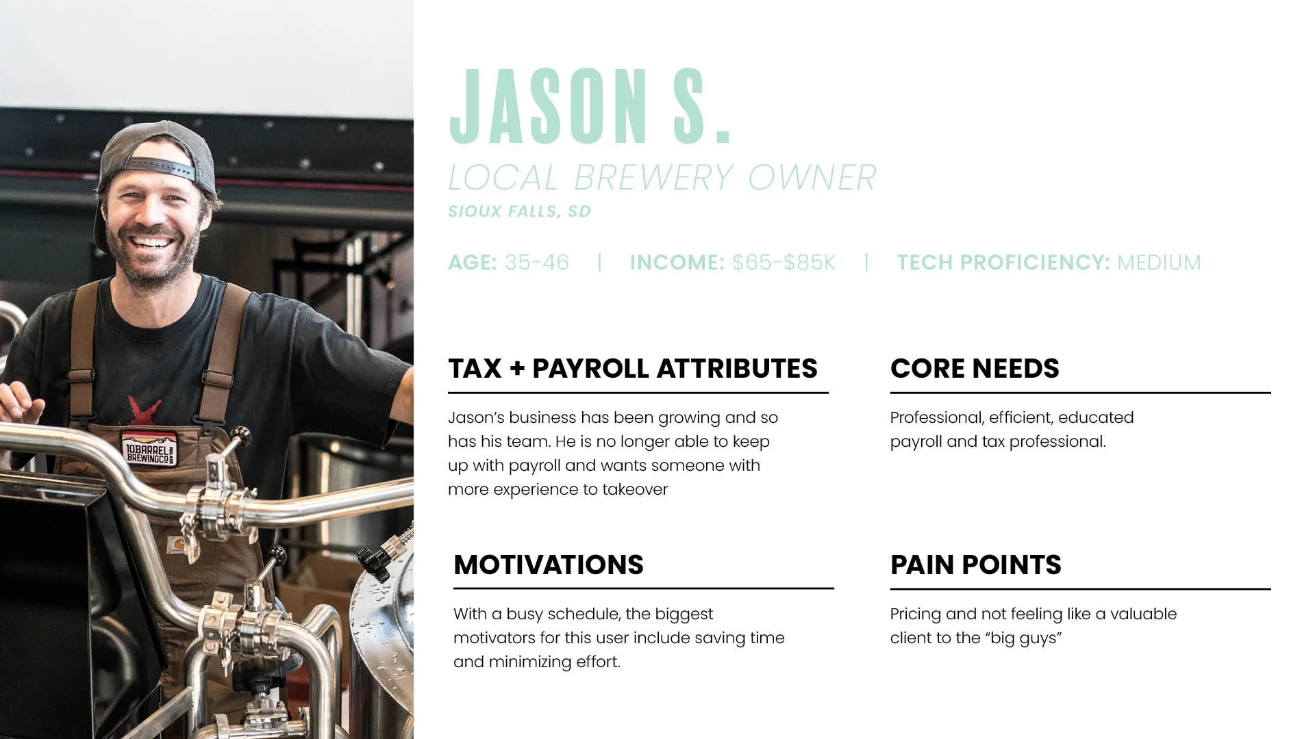
User Persona
Competitive Analysis
Informed Brainstorming
Information Architecture
WireframingContext
Hall Book & Tax approached us wanting a website that was modern and appealed to a broad audience. They were inspired by larger organizations and wanted a website that showcased how easy they could make taxes, bookkeeping, and payroll. Overall, it was our task to make taxes and payroll seem less stressful.
Problem
Wanted a website that set themselves apart from local competitors and led to a high conversion rate.Solution
A website that encourages and educates small business owners on the services, processes, and benefits that Hall Book & Tax can supply.
Understanding the problem:
Research:
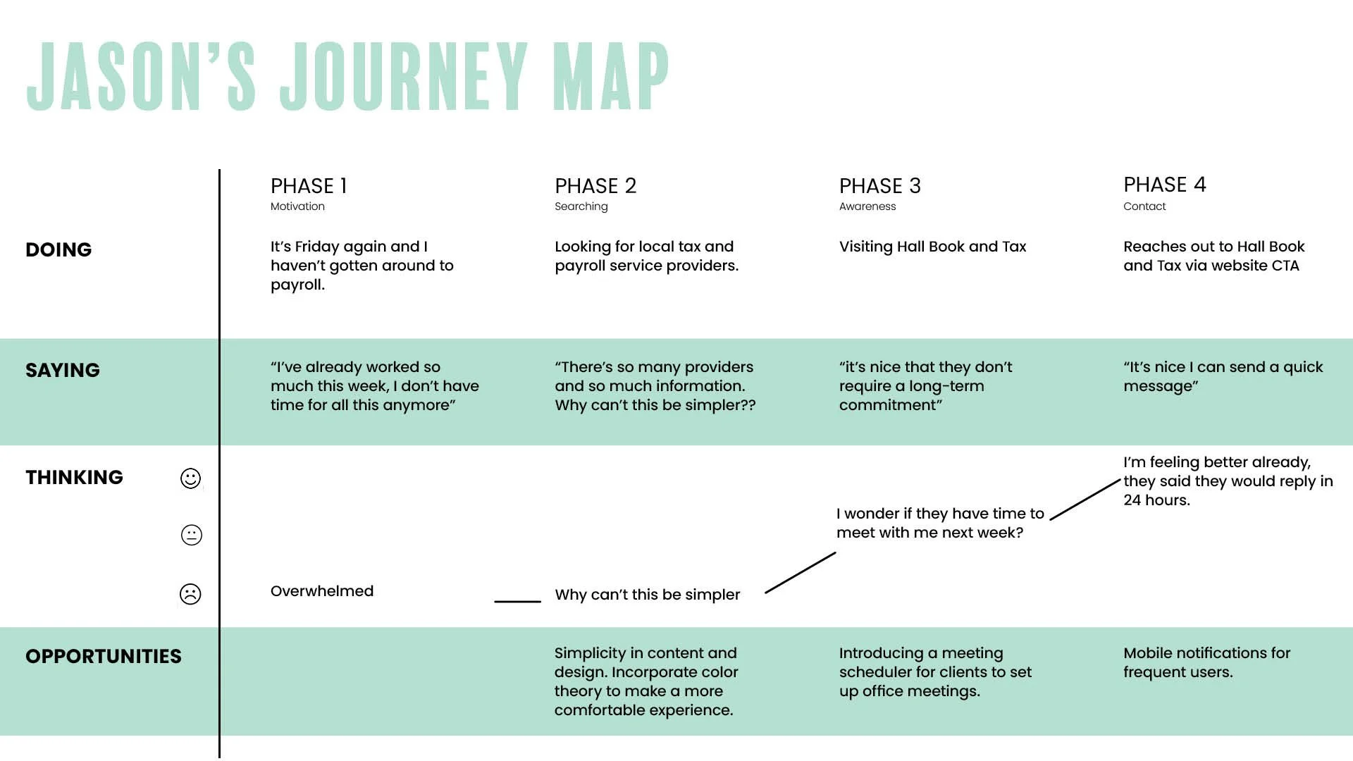
We began this project by understanding the users that Hall Book & Tax works with and how we could add value to their lives. What are their needs, what are their pain points, and how can Hall Book and Tax relate to these users and make their lives simpler? Based on those findings we knew our users would be busy business owners with limited time and budgets. So we wanted to create site content that helped them see the value in Hall Book & Tax and also spoke to their specific pain points to increase conversion.
User personas creation:
Once we had a general idea of the content and structure of the website, we began constructing its information architecture. The client wanted a site that they would be able to manage easily. Because of this, we focused on ensuring the architecture highlighted only the most vital information with easy call-to-action buttons.
Information architecture:
Before beginning on a proposed solution for Hall Book & Tax, I wanted to see what both larger and similar-sized competitors were doing. I analyzed their content, information architecture, and website ease of use.
Design
Wireframing:
Once we pinned down the information architecture, we created lo-fi website frames. This allowed us to communicate our proposed solution to the client and move forward with confidence into our final design.
Launched Product:
After presenting our findings to stakeholders and finalizing hi-fi wireframes I moved forward with developing and launching the new site. The new site included key factors, such as minimized navigation, custom illustrations, call-to-actions, customer review, and an overview of services.
Impact
Increased overall conversion.
Increase in brand recognition
Success KPI’s
Increase in site visitors
Decreased bounce rate
Reflection
This project was completed in two months and the team worked together to improve the web and mobile experience for users.If we would have had more time and a larger budget, I think it would have been benefiical to do more usability testing and conduct some additional user testing. 


